Call us on (03) 6326 4955 (Launceston). (03) 6231 2931 (Hobart).
Inspiration
3 min read
When designing a space, we often focus on layout, finishes, and materials—but colour is one of the most powerful tools in your design toolkit. Colour influences mood, atmosphere, and even how we experience a space day-to-day. So when it comes to choosing tiles, understanding the psychology of colour can help you create a room that doesn’t just look great—but feels just right.
Here’s how three popular tile colours—green, blue, and yellow—can shape your space through the lens of colour psychology.

Green: A Calming Connection to Nature
Green is one of the most versatile and universally positive colours in interior design. It’s the hue of balance, growth, and renewal, and thanks to its strong association with nature, it helps bring the outdoors in—especially when used in bathrooms, kitchens, or sun-drenched living areas.
From deep forest greens to soft sage or mint tones, green tiles can create a grounding and restorative feel in your home. Fun fact: green sits right in the middle of the visible spectrum, so it's easy on the eyes—literally. Our vision adjusts to it with minimal effort, which makes it inherently calming.
Best for: Creating restful spa-like bathrooms, nature-inspired kitchens, or tranquil living zones.

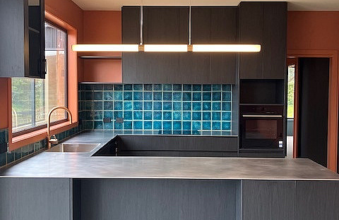
Blue: Bold, Serene, and Timeless
Blue is one of the most emotionally powerful colours in the spectrum. Deep navies and inky blues bring a sense of sophistication, confidence, and quiet strength. In contrast, softer sky blues and powder tones can create an airy, tranquil mood—perfect for spaces where calm and clarity are key.
Like green, blue also has strong ties to nature—think of clear skies and ocean horizons. Whether you're going coastal or classic, blue tiles offer endless design flexibility and can shift the feel of a room depending on the tone you choose.
Best for: Peaceful bathrooms, elegant kitchens, and serene feature walls or splashbacks.

Yellow: A Burst of Optimism and Energy
Yellow is a colour that brings the sunshine in. Associated with joy, creativity, and energy, it can instantly lift the mood of a room. Depending on the shade, yellow tiles can be playful and vibrant, rich and luxurious, or soft and sophisticated.
From mustard and ochre to bright lemon or buttery pastels, yellow works beautifully in both bold statements and small accents. It's an excellent choice for retro schemes, feature walls, or eclectic interiors that aim to surprise and delight.
Best for: Energising kitchens, cheerful powder rooms, or stylish accent areas.
Colour has the power to set the tone for your entire space—literally. By understanding the psychology behind tile colours like green, blue, and yellow, you can design rooms that not only reflect your style but also influence how you feel in them.
Need help choosing the right tile colours for your home? Visit our showroom or speak to one of our design consultants—we're here to help you create a space that feels as good as it looks.
Published on 14th May 2025
More from the blog

Client Project
2 min read
Midway Street
Some homes immediately feel calm the moment you step inside. This stunning Midway Point project by Neathouse is one of them, combining natural materials, soft textures and thoughtful detailing to create a home that is both beautiful and highly functional.
Throughout the home, a carefully curated tile selection provides consistency while allowing each space to have its own unique character. Warm stone-look porcelain is paired with handcrafted gloss splashbacks to introduce colour, texture and personality.

Product Spotlight
3 min read
Nyra by Atlas Concorde
Nyra is a stone-effect collection designed to give shape to a new idea of well-being in architectural spaces. It is not an imitation of natural materials, but an original surface developed with a biophilic approach and design sensitivity. The aesthetics are sophisticated: textures, veins, and decorative details depict a stone that does not exist in nature, designed for authentic, multisensory spaces.
Client Project
2 min read
Gwen Road
Nestled in the coastal surrounds of Port Arthur, this recently completed project on Gwen Road is a striking example of how thoughtful material selection and craftsmanship can transform a home into something truly special. Brought to life by South East Building, with bespoke joinery by Jamie Roach Joinery and expert tile installation by Mark Burn & Co, this home showcases a seamless blend of texture, tone, and personality across every space.